
Style study
The game's paintings drifted into two styles, soft painted concept art and bold inked comic. Three candidate house styles, each painted on the same four subjects. Alex chose the engraving, now frozen as the reference every new painting is made from.
 Art in progress
One world, one hand.
The concept paintings were made in two styles that compete. The landscapes and the old key art are soft painted concept art: airbrushed light, no line (the Vale, Harrowwood, the Barrow Moors, Hearthold, the Underhalls). Heaven, the factions, the champions, the characters and the monsters are a bold inked comic: black outlines, flat black shadow shapes. Side by side they read as two games.
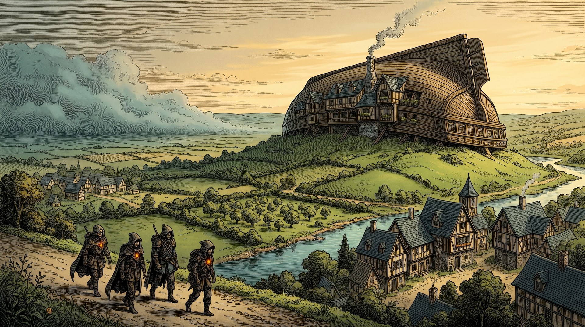
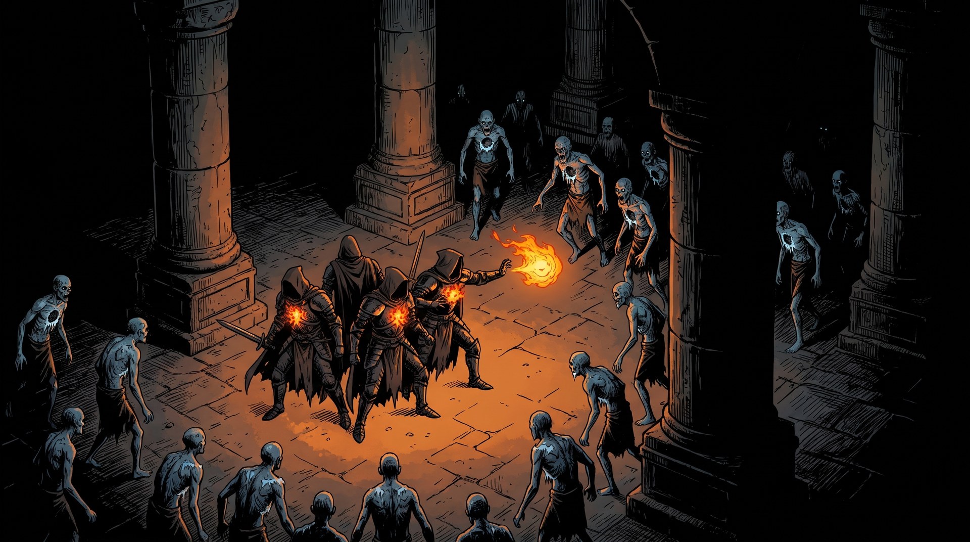
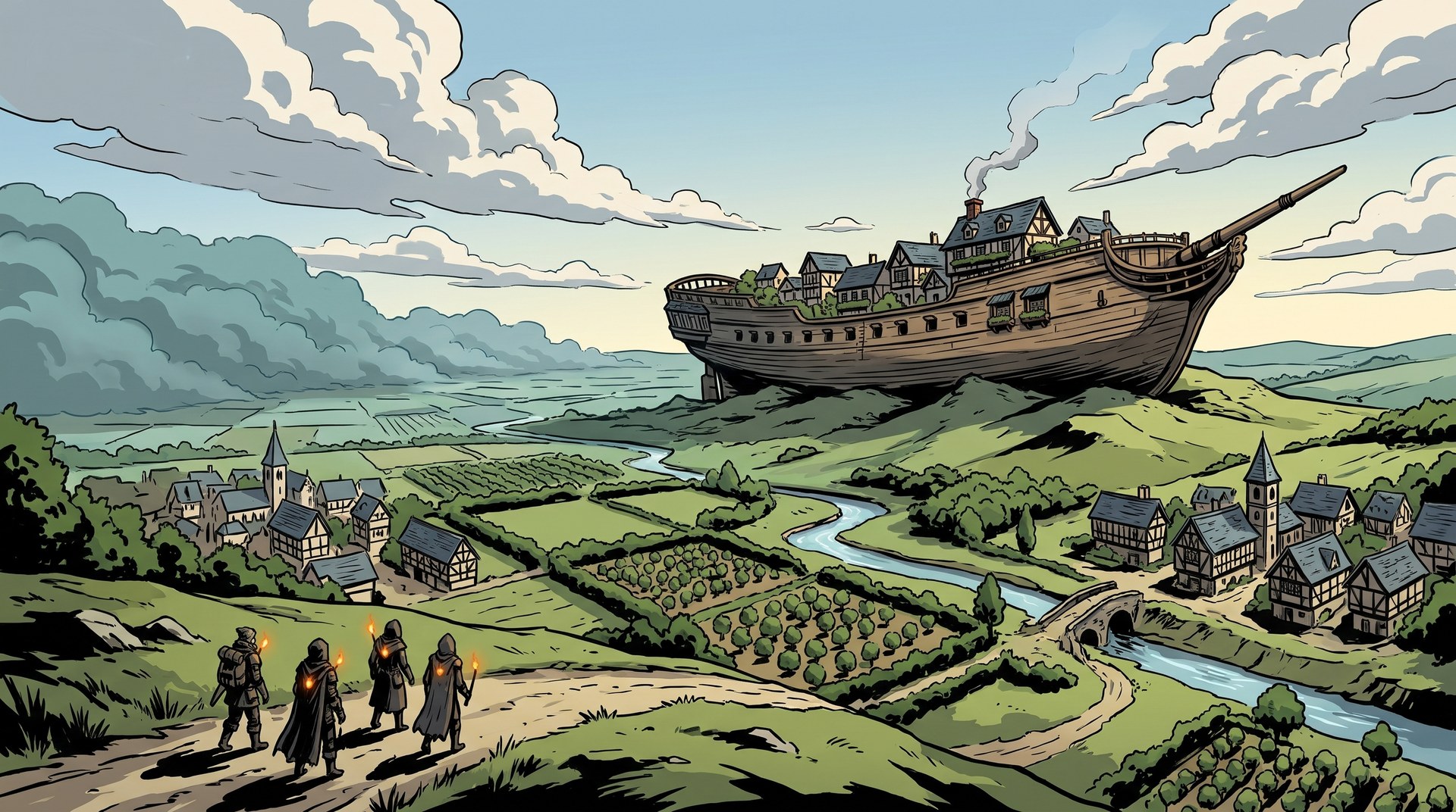
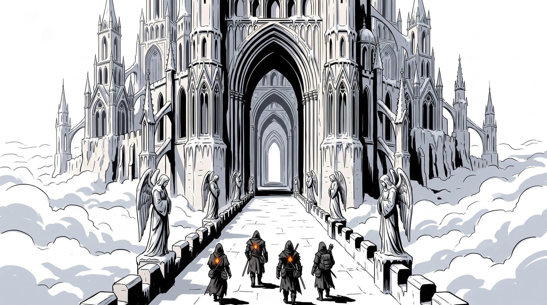
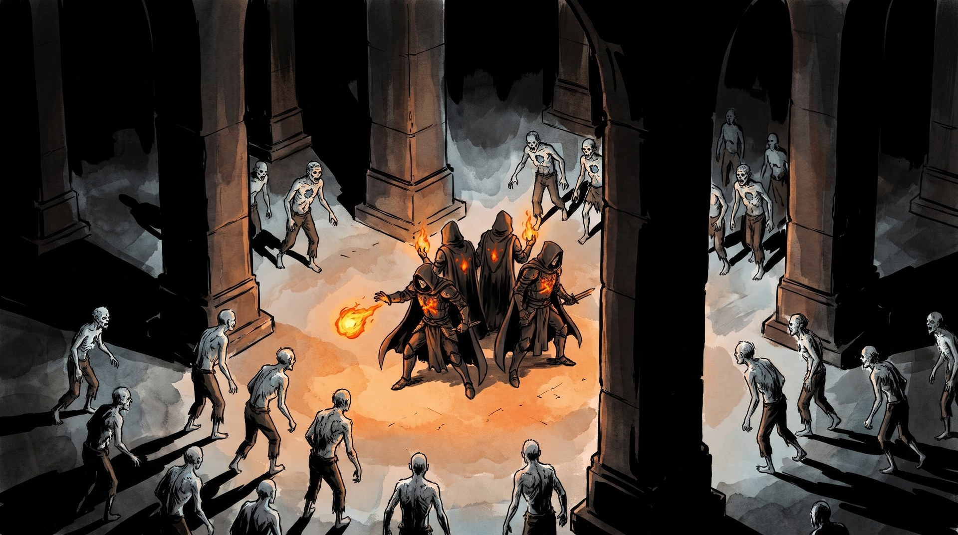
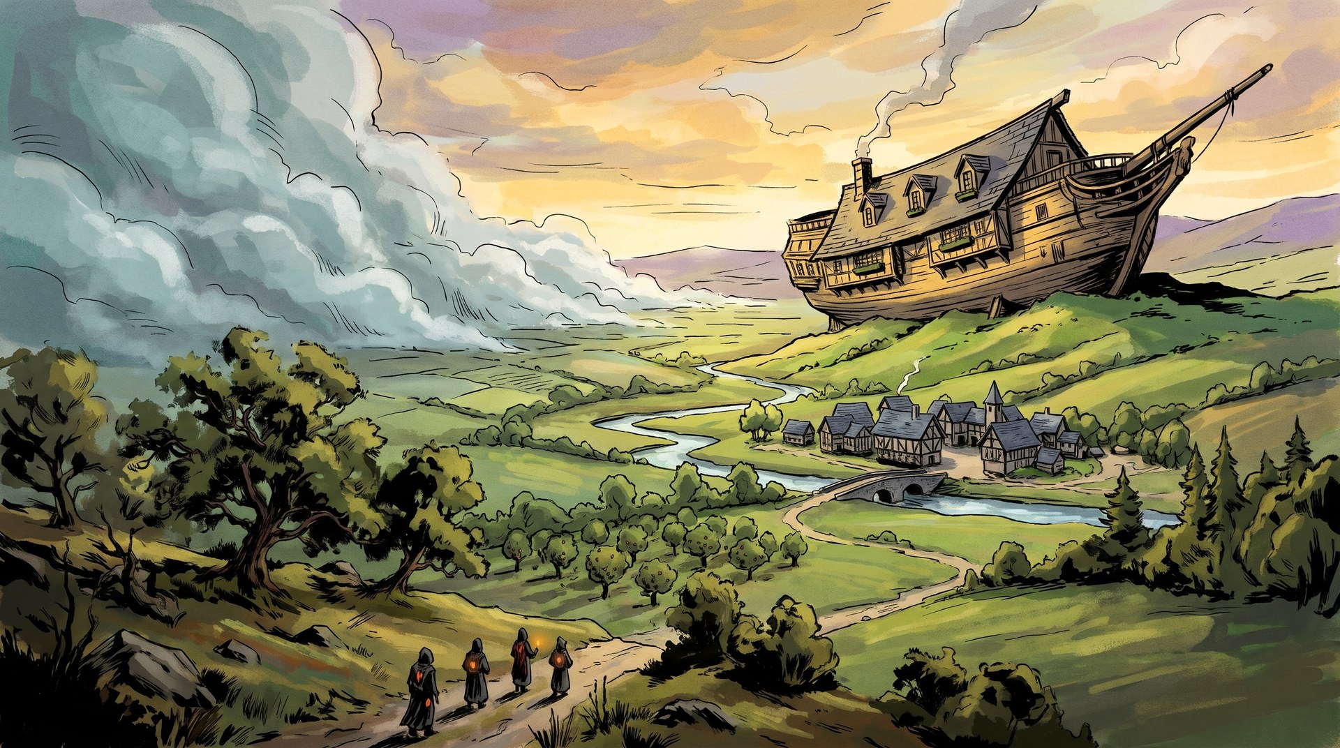
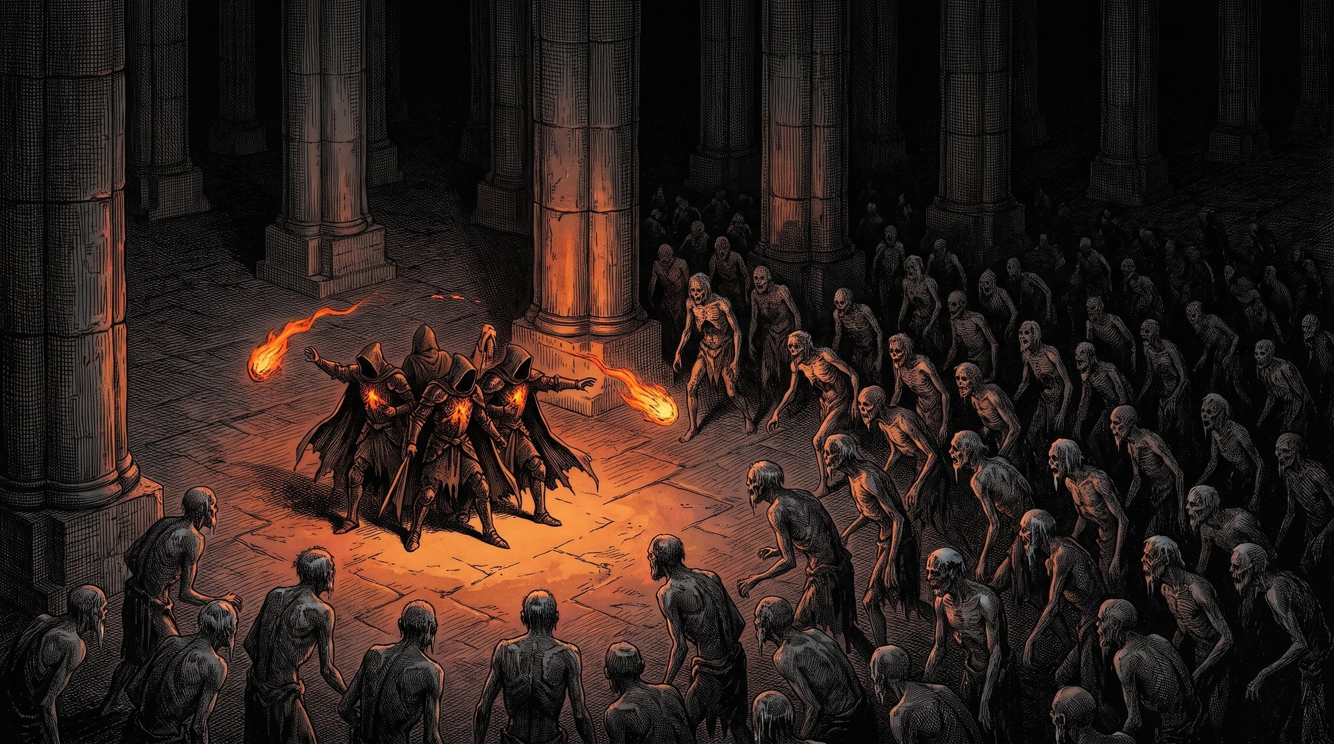
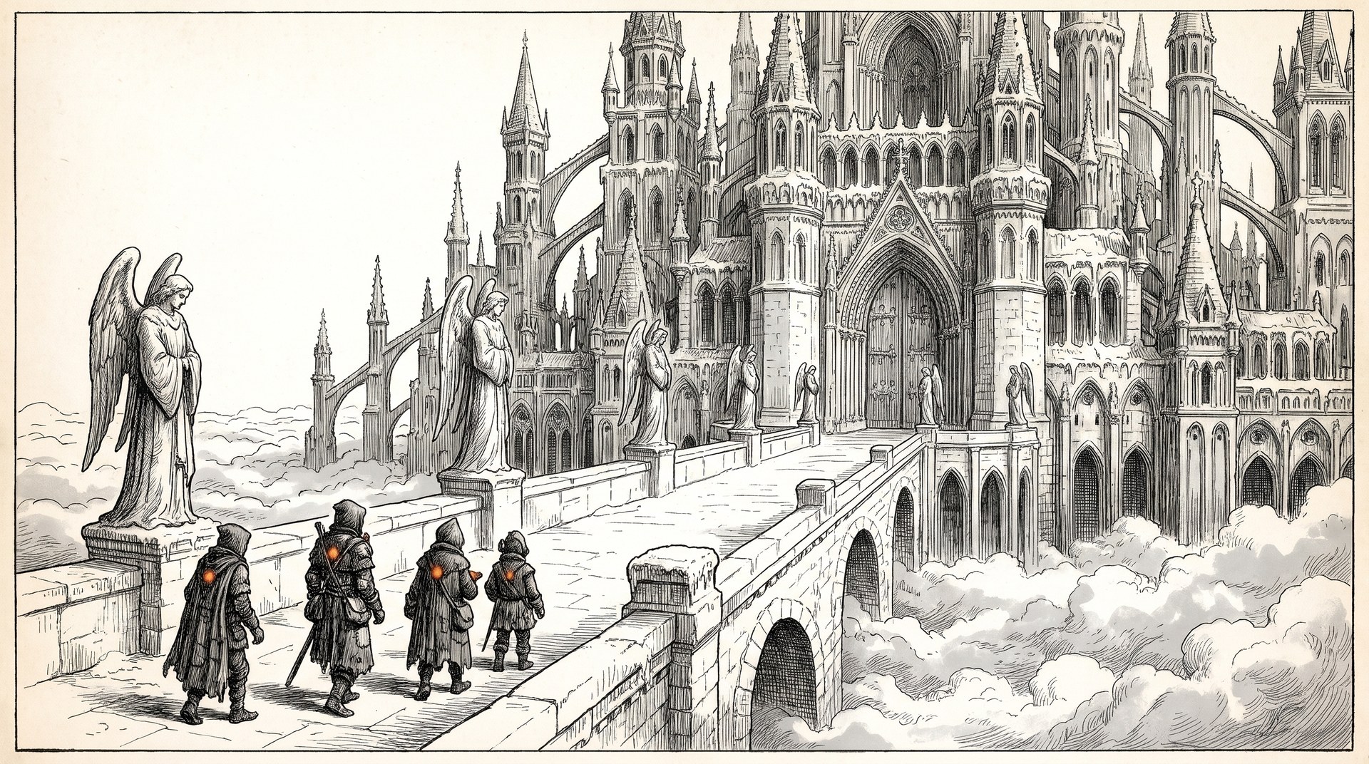
This study paints the same four subjects in three candidate house styles: the deep (a party
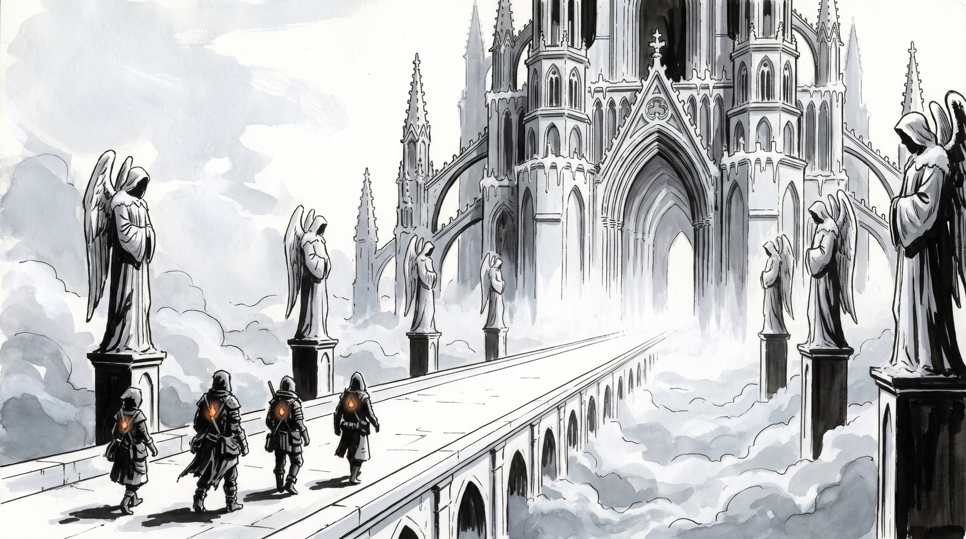
holding its light against a horde), the daylit world (the Vale with Hearthold), heaven (the bridge
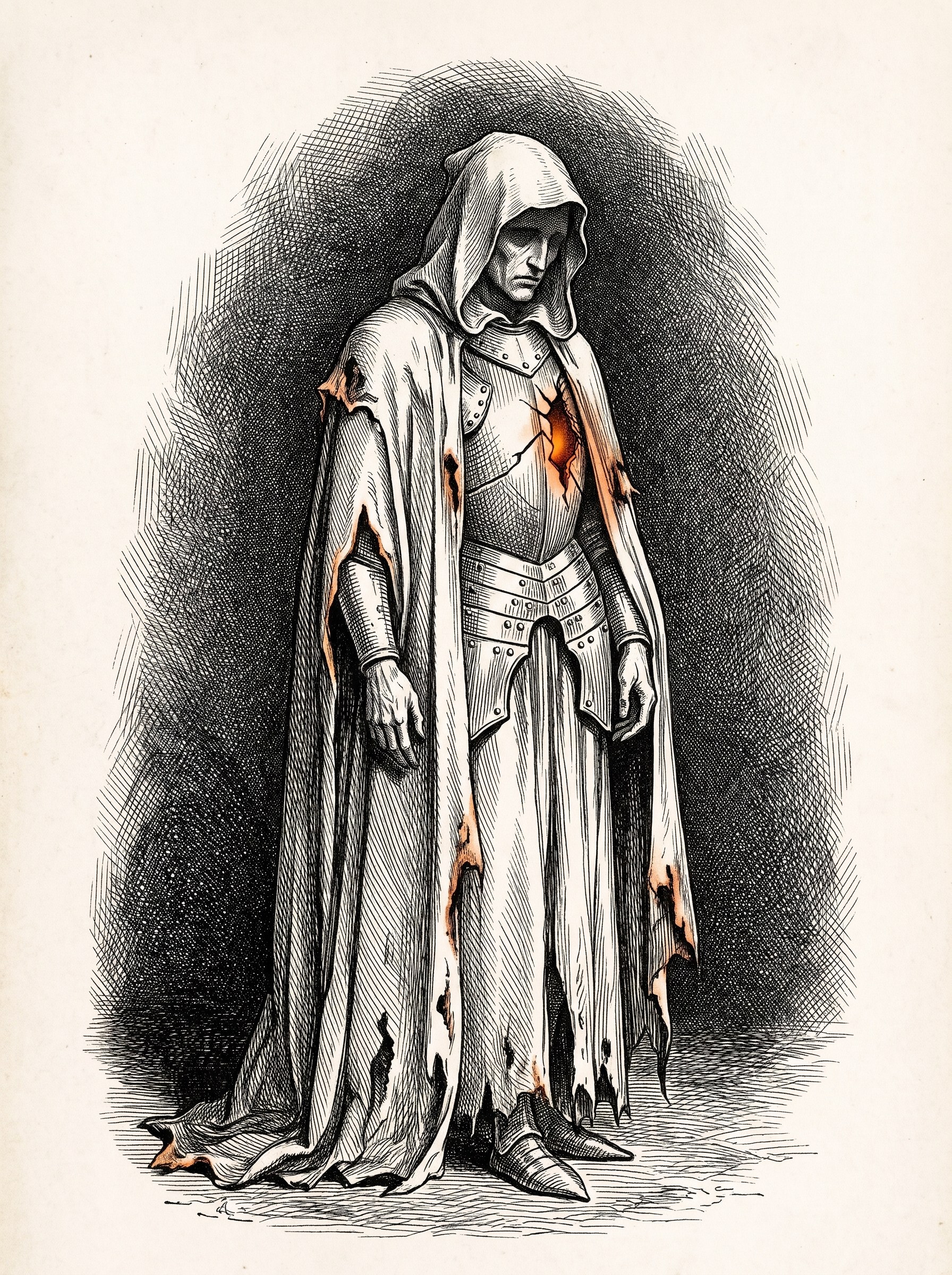
to the gate) and one fallen, head to toe. Each style was painted from one block of style words and
the same references, with design/tools/imagegen.py; the prompts are in
design/style-study/prompts/.
Alex chose C, the engraving, on 26 October 2026. It is frozen in design/style/style.json, with
one reference per register in www/art/style/, and every new painting is made from it (see the
painting guide). Click any painting to see it full size.
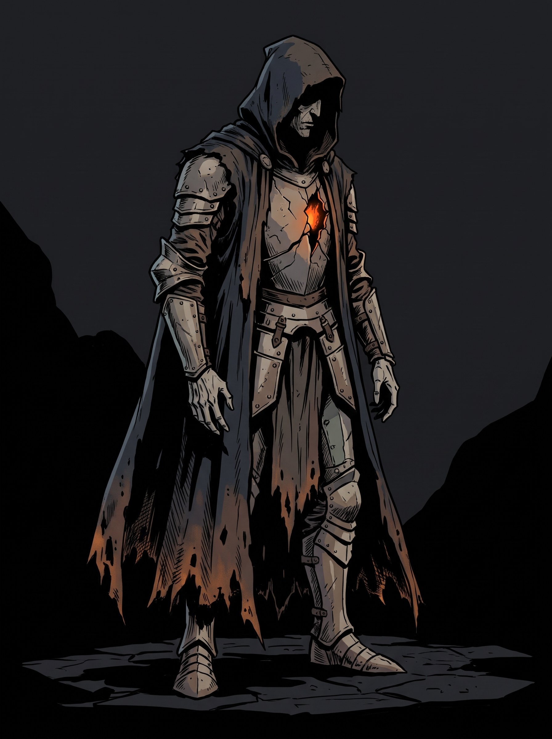
The subjects test the hard cases: heaven must stay colourless, the deep must stay dark, the Vale must keep its light, and the fallen must read as a silhouette. The study is about style; the details are not fixed (the Hearthold ship is not keel-up in any of them).
A. Inked comic
The champions' style carried everywhere: confident black outlines on every form, flat black shadow shapes after Mignola, flat colour in two or three tones per surface, no soft gradients.
 Art in progress
 Art in progress
 Art in progress
 Art in progress
- For: closest to most of the art already kept (champions, monsters, characters, heaven), so the least to repaint. The crispest read at game scale, and the nearest to what the engine can do with flat shading and an ink pass.
- Against: the daylit world loses its depth and light; the Vale reads as a comic panel, not a place you want to save.
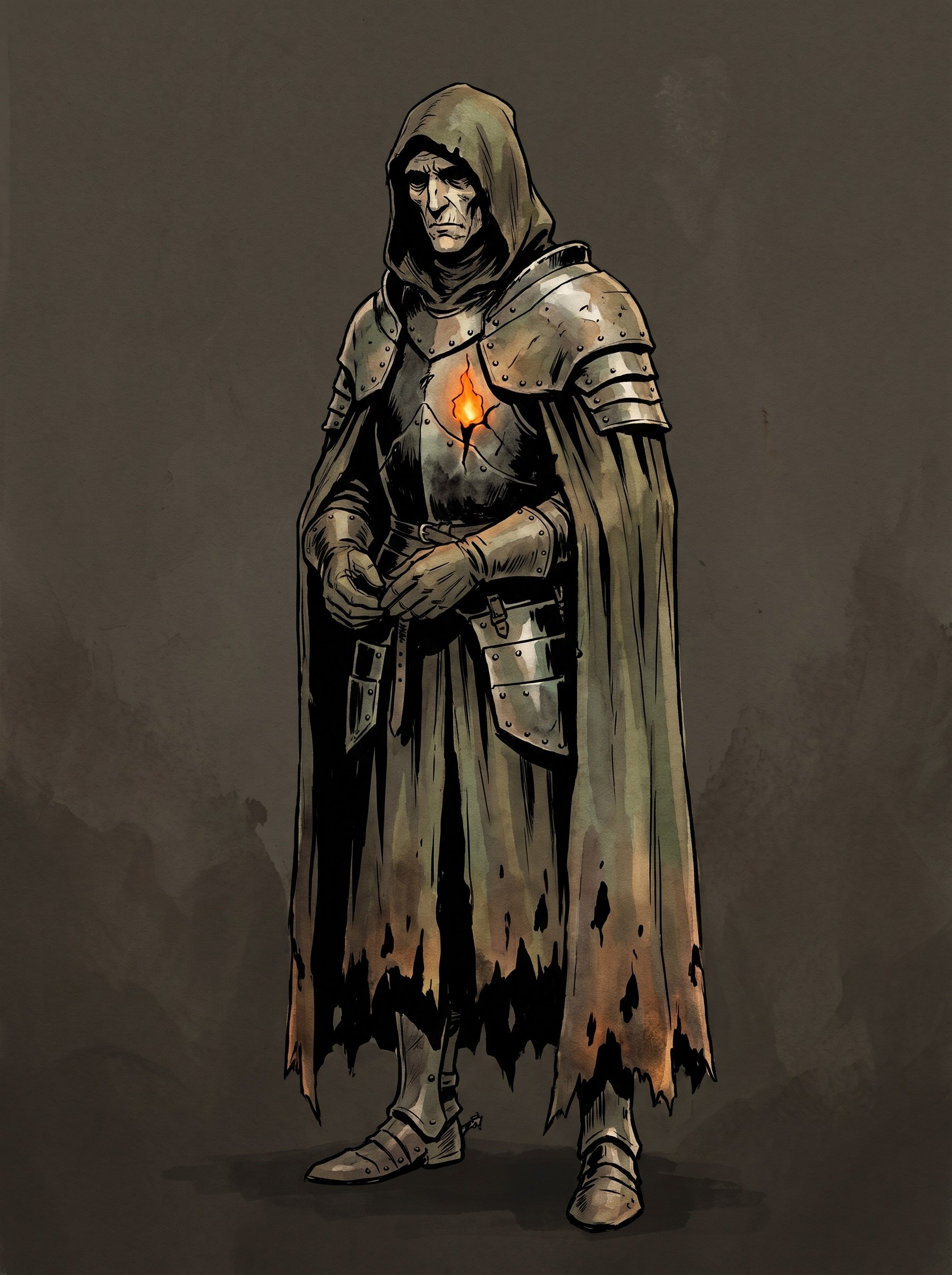
B. Ink and wash
Ink linework holds every form, with Mignola's flat shadows, laid over loose gouache and watercolour washes that keep the atmosphere, the mist and the light.
 Art in progress
 Art in progress
 Art in progress
 Art in progress
- For: the merge of the two styles rather than the win of one. The landscapes keep their sky and golden light, the deep keeps its mood, heaven stays white ink, and the line is everywhere, so ink as the war's line still reads. Painterly enough for key art, graphic enough for the game.
- Against: looser; the washes vary more from one painting to the next than flat fills do, so the references matter more.
C. Engraving
Doré's engravings: fine hatching and cross-hatching model every form, deep engraved blacks, white paper for light, a restrained hand-tinted wash over it.
 Art in progressArt in progress
 Art in progress
 Art in progress
Two more were painted after the choice, to give every register a reference: the fallen again in dark gear (the first take wore white, which the canon keeps for heaven's pieces), and heaven's white on the tinted world.
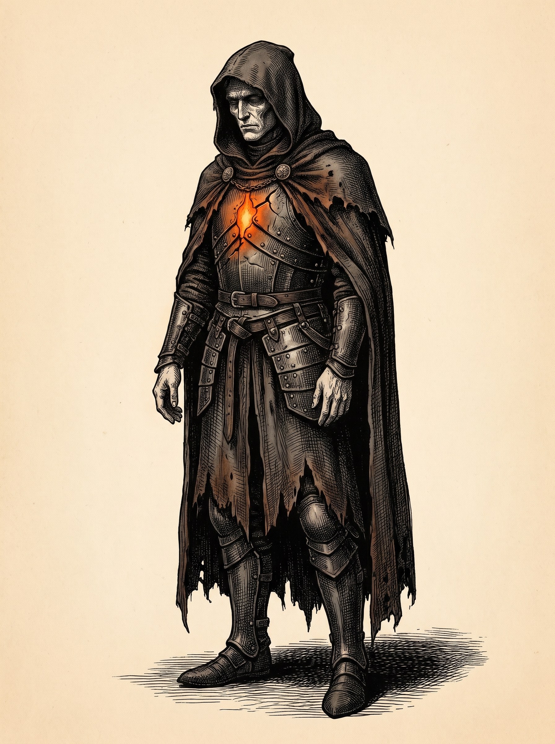 Art in progress
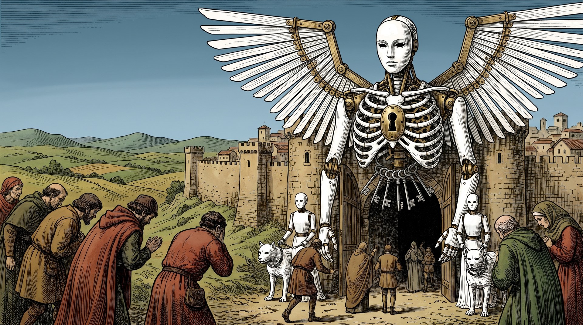 Art in progress
- For: the most distinctive and the richest; heaven is at its best here, and Doré is already heaven's named reference.
- Against: the furthest from the art already kept, so the most to repaint. The hatching turns to noise at small sizes (icons, the HUD, a fallen 70 pixels tall), and the engine can't follow it. The paintings are the style; the game's own rendering keeps its rules on visual identity.
The choice
C, the engraving, chosen by Alex on 26 October 2026. The study had recommended B, ink and wash, as the merge of the two old styles; Alex preferred the engraving, the most distinctive of the three and the one heaven was already named after.